Simple-Modal
Basic
Let's say you want to create a simple Simple-Modal. So let's take an example how you do it, check it out below.
For model developer have to create state, just like :
const [isModalOpen, setIsModalOpen] = useState(false);
For onClose And onBackDrop event developer have to create two funtion, just like :
const handleClose = () => {setIsModalOpen(false);};
const handleBackdrop = () => {setIsModalOpen(false);};
<Modal
containerStyle={{ maxWidth: 1000 }}
isVisible={isModalOpen}
title="Modal Title"
onClose={handleClose}
onBackDrop={handleBackdrop}>
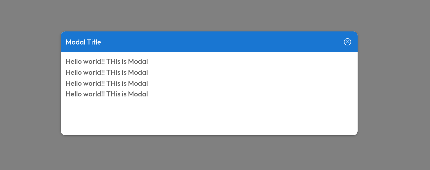
<h4>Hello world!! THis is Modal </h4>
<h4>Hello world!! THis is Modal </h4>
<h4>Hello world!! THis is Modal </h4>
<h4>Hello world!! THis is Modal </h4>
</Modal>
The above code will render Time like this.
Props
| Name | Type | Required | Description |
|---|---|---|---|
| isVisible | boolean | Yes | name of a input. |
| title | string | Yes | Title of modal |
| children | React.ReactNode | Yes | ------ |
| containerStyle | CSSProperties | No | ------ |
| headerStyle | CSSProperties | No | ------ |
| backdropStyle | CSSProperties | No | ------ |
| headerIcon | string | No | ------ |
Events
| Name | Type | Required | Description |
|---|---|---|---|
| onClose | () => void | Yes | To close the modal |
| onBackDrop | () => void | No | ------ |